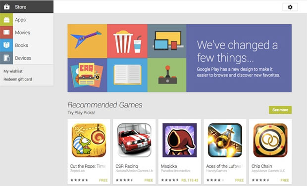
A few months back Google changed the Play store look for Android users, proving with a clean, easy and comprehensive interface. Now the company has pushed out a similar update for the web version of Play Store.
The new design comes with large icons for apps, music, movies and books. Users can navigate the new site using a category “menu” on the left side of the screen with a less cluttered look compared to the previous version.
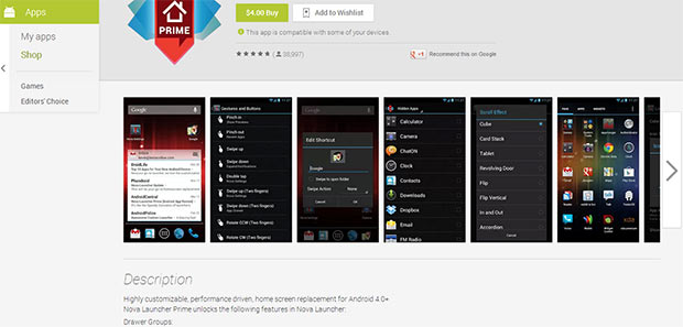
The slideshow for apps is gone now and it starts with recommended apps which load content automatically as you scroll down. Click on an app link quickly loads a new page in the same window with a nice animation. The layout is very clean which provides you with the Details on the top, then screenshots and after that you can read the description and user reviews.
The compatibility list is now shown as a drop down list when you click on the link below the application install button. You can see all your downloaded apps from “My orders” page and now you can also rename your devices or hide them from showing in compatibility list.
The new Play Store also hints the possibility for Google Glass owners to access Play Store very soon. To find out more about the new Play Store UI head over to http://play.google.com.


